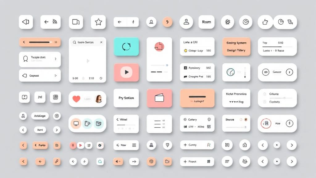
Building consistent, scalable design foundations.
Building Scalable Design Foundations
A design system is more than a component library—it's a shared language that enables teams to build consistent, efficient, and coherent digital products. Creating one requires strategic thinking beyond individual components.
What Is a Design System?
Definition
A design system encompasses:
- Design principles and values
- Visual style guidelines
- Component library
- Pattern documentation
- Voice and tone standards
- Implementation resources
Benefits
- Consistent user experience
- Faster design and development
- Easier maintenance
- Simplified onboarding
- Reduced decision fatigue
- Better collaboration
Starting Points
Audit Existing Work
Before creating, understand what exists:
- Inventory current components
- Document inconsistencies
- Identify common patterns
- Note pain points
Define Principles
Establish guiding values:
- What does good design mean for you?
- What constraints exist?
- What problems must you solve?
- What makes your product unique?
Foundation Elements
Color System
Build a flexible palette:
- Primary and secondary brand colors
- Semantic colors (success, warning, error)
- Neutral scale for backgrounds and text
- Accessibility considerations
- Dark mode variants
Typography
Define the type system:
- Font family selections
- Size scale
- Weight variations
- Line height standards
- Letter spacing adjustments
Spacing
Create consistent rhythm:
- Base unit (4px or 8px common)
- Scale progression (4, 8, 12, 16, 24, 32, 48...)
- Component padding standards
- Layout margin conventions
Elevation
Define depth:
- Shadow scales
- Usage guidelines
- Z-index management
- Border alternatives
Component Architecture
Atomic Design
Build from smallest to largest:
- Atoms: Basic elements (buttons, inputs, icons)
- Molecules: Simple combinations (search bar, form field)
- Organisms: Complex sections (header, card grid)
- Templates: Page layouts
- Pages: Specific instances
Component Properties
Define variants and states:
- Size options (small, medium, large)
- Style variants (primary, secondary, ghost)
- States (default, hover, active, disabled)
- Context adaptations
Documentation
Usage Guidelines
Explain when and how:
- Purpose and context
- Dos and don'ts
- Best practices
- Edge cases
Code Examples
Provide implementation:
- Copy-paste ready code
- Props documentation
- Event handling
- Accessibility notes
Visual Examples
Show, don't just tell:
- Component states
- Correct usage
- Incorrect usage
- Real-world examples
Tokens and Variables
Design Tokens
Abstract design decisions:
- Color values stored as variables
- Spacing units as tokens
- Typography as reusable values
- Platform-agnostic definitions
Benefits of Tokens
- Single source of truth
- Easy global updates
- Platform translations
- Theming support
Governance and Process
Contribution Model
How do changes happen?
- Who can propose changes
- Review process
- Approval requirements
- Version control
Versioning
Track evolution:
- Semantic versioning (major.minor.patch)
- Changelog maintenance
- Migration guides
- Deprecation process
Communication
Keep teams informed:
- Release announcements
- Office hours or support
- Feedback channels
- Training resources
Implementation Strategy
Start Small
Don't try to systematize everything at once:
- Begin with highest-impact components
- Expand based on need
- Learn and adapt as you go
Adoption Plan
Get teams on board:
- Quick wins build momentum
- Champion program
- Clear value communication
- Support during transition
Tooling
Support the system:
- Design tools (Figma libraries)
- Code repositories
- Documentation sites
- Integration resources
Measuring Success
Adoption Metrics
- Component usage rates
- Code reuse statistics
- Design file library usage
- Support request volume
Quality Metrics
- UI inconsistencies over time
- Accessibility audit results
- Design-to-development time
- User satisfaction scores
Common Challenges
Getting Buy-In
Stakeholders need to see value:
- Demonstrate efficiency gains
- Show consistency improvements
- Calculate maintenance costs
- Compare to industry standards
Balancing Flexibility
Not too rigid, not too loose:
- Allow valid variations
- Document exceptions
- Update system when patterns emerge
- Trust team judgment
Maintaining Momentum
Design systems require ongoing care:
- Dedicated resources
- Regular reviews
- Continuous improvement
- Active community
A design system is never finished—it evolves with your product and team. The investment in creating one pays dividends in consistency, efficiency, and quality. Start where you are, use what you have, and improve continuously.