
Design
Designing Client Portals That People Actually Want to Use
Most client portals feel like afterthoughts. Learn the design principles and technical patterns behind portals that drive adoption and reduce support tickets.
We use cookies to enhance your browsing experience and analyze our traffic. By clicking "Accept", you consent to our use of cookies. Learn more
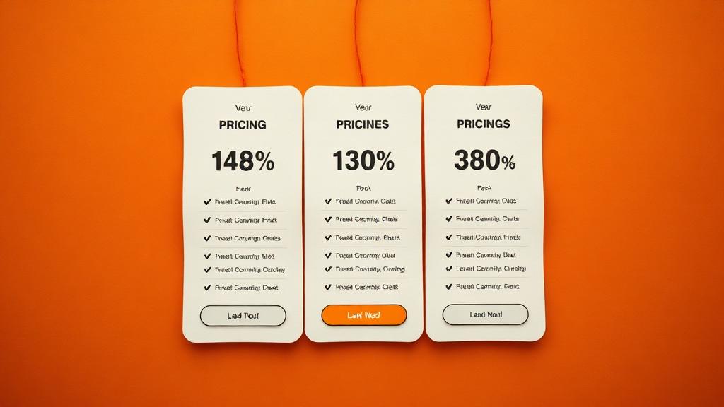
Optimize your pricing page layout for maximum conversions.
Your pricing page sits at a crucial decision point in the customer journey. Visitors who reach pricing have interest but not yet commitment. The design, structure, and psychology of your pricing presentation can make the difference between conversion and abandonment. Effective pricing page design combines clarity about offerings with persuasion techniques that guide visitors toward action.
Highlighting a recommended plan guides uncertain visitors toward confident decisions. When faced with multiple options, many visitors experience decision paralysis. A clearly marked recommended or popular plan provides social proof and simplifies choice. This guidance increases conversions for that plan while reducing abandonment.
Clear feature comparison enables informed decisions without requiring visitors to navigate away. Feature matrices should prioritize benefits over technical specifications and highlight differentiating capabilities. Visitors should understand exactly what each tier provides and what they would gain by upgrading.
Toggle switches between annual and monthly pricing let visitors choose their payment preference. Annual plans typically offer discounts that incentivize longer commitments. Showing the savings explicitly encourages annual selection while maintaining monthly options for those who prefer them.
FAQ sections below pricing address objections and answer questions that might otherwise delay decisions. Common questions about refunds, upgrades, payment methods, and plan details deserve clear answers. Addressing these preemptively removes friction from the decision process.
Anchor pricing with a premium tier establishes value reference points. When a high-priced option appears first, subsequent options feel more affordable by comparison. Even if few customers select the premium tier, its presence makes other options seem reasonably priced.
Strategic use of a decoy option can steer choices toward desired outcomes. A deliberately less attractive option makes the target option more appealing by comparison. This technique requires careful calibration to feel natural rather than manipulative.
Money-back guarantees reduce perceived risk and remove barriers to trying your service. The guarantee addresses concerns about product fit without requiring extensive pre-purchase evaluation. For subscription businesses, risk reversal can dramatically improve conversion rates.
Social proof elements throughout the pricing page reinforce that others have made similar decisions. Customer counts, logo displays, or testimonials near pricing information provide reassurance at the decision point. Specific proof like customer numbers or measurable results carries more weight than generic claims.
Clear calls to action leave no ambiguity about how to proceed. Button text should specify outcomes, such as Start free trial or Subscribe now, rather than generic options like Continue. Each plan should have its own prominent action button with distinct treatment for the recommended option.
Minimal form fields reduce friction that kills conversions. Request only essential information initially, gathering additional details later. Every additional field provides another opportunity for abandonment. Progressive information collection spreads the burden across the relationship.
Trust signals near action buttons address last-moment hesitation. Security badges, payment method logos, and brief policy reminders provide reassurance exactly when visitors need it. These signals are particularly important for first-time visitors unfamiliar with your brand.
Mobile optimization ensures that pricing pages work effectively on all devices. Complex comparison tables may need restructured presentations for small screens. Touch targets for buttons must be appropriately sized. Testing on actual mobile devices reveals issues that desktop testing misses.
Effective pricing page design respects visitors' time while guiding them toward decisions that benefit both parties. The combination of clear information, psychological insight, and frictionless process creates experiences that convert interest into commitment. Continuous testing and refinement progressively improve performance over time.
Most client portals feel like afterthoughts. Learn the design principles and technical patterns behind portals that drive adoption and reduce support tickets.
UI/UX patterns that not only look beautiful but also drive user engagement.
Understanding the importance of designing for mobile devices first.
Let's discuss how we can help bring your vision to life.