
We value your privacy

    We use cookies to enhance your browsing experience and analyze our traffic. By clicking "Accept", you consent to our use of cookies. Learn more
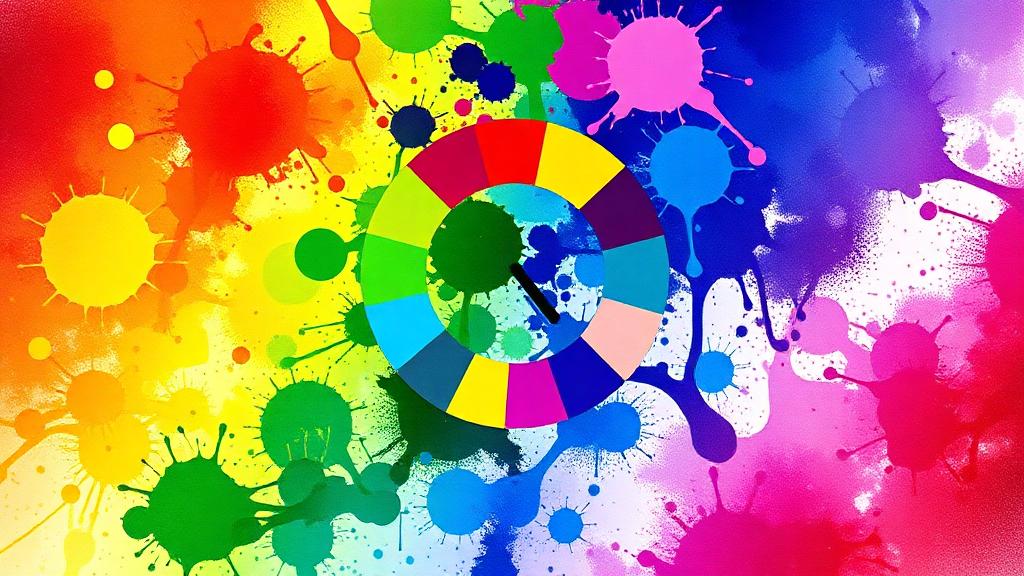
    The Psychology of Color in Web Design
    Design

    The Psychology of Color in Web Design

    Filtedev

    Filtedev

    WE CARE

    7 min read

    How colors influence user behavior and brand perception online.

    The Science of Color in Digital Experiences

    Color isn't just aesthetic—it's psychological. Colors trigger emotional responses, influence perceptions, and guide behavior. Understanding color psychology helps you design experiences that resonate and convert.

    How Color Affects Users

    Emotional Responses

    Colors evoke consistent emotional reactions:

    • Blue: Trust, security, calmness
    • Red: Urgency, excitement, passion
    • Green: Growth, health, nature
    • Orange: Energy, enthusiasm, action
    • Purple: Luxury, creativity, wisdom
    • Yellow: Optimism, warmth, attention
    • Black: Sophistication, power, elegance
    • White: Purity, simplicity, space

    Cultural Variations

    Context matters:

    • White symbolizes mourning in some Eastern cultures
    • Red represents luck in China, danger in West
    • Green has religious significance in Islam
    • Research your target audience

    Color and Conversion

    CTA Button Colors

    The eternal debate: what color converts best?

    The truth: contrast matters more than color. Your CTA should stand out from surrounding elements. If your site is blue, orange CTAs pop. If it's orange, blue might work better.

    A/B Test Results

    • Changing button color can impact conversions 20%+
    • But results vary by context
    • Test for your specific audience and design
    • Don't assume universal "best" colors

    Creating Urgency

    Warm colors encourage action:

    • Red for limited-time offers
    • Orange for "buy now" buttons
    • Yellow for highlights and attention

    Building Trust Through Color

    Professional Palettes

    Industries have color expectations:

    • Finance: Blue conveys stability
    • Health: Blue/green suggests cleanliness
    • Luxury: Black/gold/purple signals premium
    • Tech: Blue/white implies innovation
    • Environmental: Green/earth tones feel natural

    Consistency Builds Recognition

    Use color consistently:

    • Primary brand color throughout
    • Consistent meaning (red always for errors)
    • Predictable interactive element colors
    • Cohesive across all pages

    Accessibility Considerations

    Color Contrast

    Ensure readability:

    • 4.5:1 ratio for normal text (WCAG AA)
    • 3:1 for large text
    • 3:1 for UI components
    • Test with contrast checker tools

    Color Blindness

    Don't rely solely on color:

    • 8% of men have color vision deficiency
    • Add icons or patterns for meaning
    • Ensure text labels accompany color coding
    • Test with color blindness simulators

    Building a Color System

    Primary Color

    Your main brand color:

    • Use sparingly for maximum impact
    • Reserve for key elements
    • Ensure versatility across uses

    Secondary Colors

    Support the primary:

    • Complementary or analogous choices
    • Specific purposes (success, warning, info)
    • Enough variation for hierarchy

    Neutral Colors

    The workhorses:

    • Backgrounds and text
    • Borders and dividers
    • Multiple shades for depth
    • Warm or cool based on brand

    Dark Mode Considerations

    Inverted Psychology

    Dark mode shifts perceptions:

    • Blue can feel more prominent
    • White text is stark—consider off-white
    • Saturated colors may vibrate
    • Adjust brand colors as needed

    Maintaining Identity

    Keep brand recognition:

    • Consistent primary color (adjusted)
    • Same emotional impact
    • Careful contrast maintenance

    Color in Different Contexts

    Backgrounds

    Set the stage:

    • Light backgrounds for content-heavy pages
    • Dark for immersive experiences
    • Subtle color for brand presence
    • Consider eye strain for long sessions

    Data Visualization

    Clear meaning in charts:

    • Consistent color = consistent meaning
    • Colorblind-safe palettes
    • Sufficient differentiation
    • Legend clarity

    Trends vs. Timelessness

    Following Trends

    Trendy colors feel current but date quickly:

    • Gradient overlays
    • Specific "color of the year" choices
    • Industry fad colors

    Timeless Approaches

    Some principles endure:

    • Adequate contrast
    • Strategic accent use
    • Neutral-heavy palettes
    • Consistent application

    Testing Color Choices

    Methods

    Validate your choices:

    • A/B testing specific elements
    • Eye-tracking studies
    • User feedback sessions
    • Accessibility audits

    Metrics to Watch

    • Conversion rate changes
    • Time on page
    • Bounce rate
    • User preference surveys

    Color is powerful precisely because it works subconsciously. Users may not articulate why a site feels trustworthy or why they clicked a button, but color played a role. Use this power thoughtfully to create experiences that achieve your goals while serving users well.

    Share this article:

    Ready to Start Your Project?

    Let's discuss how we can help bring your vision to life.