
We value your privacy

    We use cookies to enhance your browsing experience and analyze our traffic. By clicking "Accept", you consent to our use of cookies. Learn more
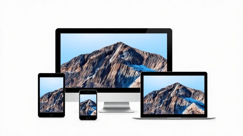
    The Complete Guide to Responsive Images
    Development

    The Complete Guide to Responsive Images

    Filtedev

    Filtedev

    WE CARE

    9 min read

    Optimizing images for every screen size and device.

    Optimizing Images for Every Device

    Images typically account for most of a webpage's weight. Serving appropriate images for each device and context dramatically improves performance without sacrificing visual quality.

    The Responsive Image Challenge

    Different devices need different images:

    • Mobile phones: smaller images suffice
    • Retina displays: higher resolution required
    • Slow connections: aggressive compression helps
    • Large monitors: full resolution appropriate

    One-size-fits-all wastes bandwidth and impacts performance.

    HTML Solutions

    srcset Attribute

    Provide multiple resolutions:

    The browser chooses the best image based on device pixel ratio and viewport size.

    sizes Attribute

    Tell the browser how large the image will display:

    The browser uses this information with srcset to choose optimally.

    picture Element

    For art direction (different crops for different sizes):

    picture allows completely different images per breakpoint.

    Image Formats

    JPEG

    • Best for photographs
    • Lossy compression
    • Widely supported
    • Use for complex images with gradients

    PNG

    • Lossless compression
    • Supports transparency
    • Larger file sizes than JPEG
    • Use for graphics, screenshots, transparency

    WebP

    • Modern format with excellent compression
    • Supports both lossy and lossless
    • Transparency support
    • 25-35% smaller than JPEG
    • 95%+ browser support

    AVIF

    • Next-generation format
    • Even better compression than WebP
    • Growing browser support
    • Use with fallbacks

    Compression Strategies

    Quality vs. Size

    Find the right balance:

    • Start at 80-85% quality for JPEG
    • Use tools to compare visual quality
    • Different images tolerate different compression
    • Automate optimization in build process

    Tools for Optimization

    • Sharp (Node.js library)
    • ImageMagick
    • Squoosh (browser-based)
    • Build tools (webpack, Vite plugins)

    Lazy Loading

    Native Lazy Loading

    Browser handles loading on demand:

    loading="lazy" defers images until near viewport.

    Intersection Observer

    More control over lazy loading:

    • Custom thresholds for when to load
    • Loading animations or placeholders
    • Integration with image CDNs

    Placeholder Strategies

    Blur-Up Technique

    Show tiny blurred version while loading:

    • Inline tiny base64 image
    • Fade in full image when loaded
    • Perceived performance improves

    LQIP (Low-Quality Image Placeholder)

    Similar to blur-up:

    • Generate very low-res placeholder
    • Progressive enhancement
    • Better than empty space

    Skeleton Screens

    Show image-shaped placeholder:

    • Indicates expected layout
    • Prevents layout shift
    • Clean, modern approach

    Performance Metrics

    Impact on Core Web Vitals

    Images affect:

    • LCP (Largest Contentful Paint): Main image load time
    • CLS (Cumulative Layout Shift): Images without dimensions cause shift

    Best Practices for Core Web Vitals

    • Specify width and height attributes
    • Use aspect-ratio CSS
    • Preload LCP images
    • Serve appropriately sized images

    Image CDNs

    Benefits

    • Automatic format selection
    • On-the-fly resizing
    • Global distribution
    • Caching optimization

    Popular Options

    • Cloudinary
    • Imgix
    • Cloudflare Images
    • Vercel Image Optimization

    Automation

    Build-Time Optimization

    • Generate multiple sizes during build
    • Convert to modern formats
    • Compress appropriately
    • Output responsive image markup

    Runtime Optimization

    • CDN handles transformations
    • Request optimal format based on Accept header
    • Resize on demand
    • Cache transformed versions

    Implementation Checklist

    1. Generate multiple sizes for each image
    2. Provide srcset with appropriate breakpoints
    3. Use sizes attribute for layout hints
    4. Serve modern formats with fallbacks
    5. Implement lazy loading
    6. Include width/height to prevent shift
    7. Use placeholders for better perceived performance
    8. Compress appropriately for content type

    Testing Responsive Images

    DevTools

    • Emulate different devices
    • Check network tab for loaded image
    • Verify srcset selection

    Lighthouse

    • Reports image optimization opportunities
    • Identifies oversized images
    • Flags missing modern formats

    The Investment Pays Off

    Image optimization is effort well spent:

    • Faster page loads
    • Lower bandwidth costs
    • Better SEO rankings
    • Improved user experience
    • Higher conversion rates

    Every image on your site deserves attention to how it's served across devices.

    Share this article:

    Ready to Start Your Project?

    Let's discuss how we can help bring your vision to life.